Book Birthday and Fun Announcements!

For a detailed image, click on thumbnail.

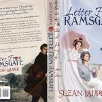
A year ago today, Letter from Ramsgate was released to quickly become an Amazon bestseller, thanks to the readers. I got a giggle when I saw an old post that wondered what its cover would look like (speculating on who would be Mr. Darcy), as it’s an awesome cover with a terrifically handsome Mr. Darcy on the back.

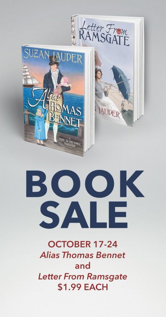
Today, in anticipation of the release of A Most Handsome Gentleman, Meryton Press announced a book sale for Letter from Ramsgate and my first published novel, Alias Thomas Bennet.For those who are new to these two books, both are variations of Jane Austen’s Pride and Prejudice and have happy endings. Letter from Ramsgate has a great deal of angst, and is suited to all readers mature enough to read and appreciate Pride and Prejudice. Alias Thomas Bennet has a mystery component and is suited to mature readers who are not sensitive to trigger scenes. Both are highly rated by readers, earning Amazon reviews averaging greater than four stars out of five. I myself enjoy re-reading them from time to time!

If that was not enough fun for you, Meryton Press has posted a Q&A session with me along with the book sale announcement. Find out a little more than you can usually read in the author bio!

I’m also pleased to note that I’ll be stopping at 15 blogs during the A Most Handsome Gentleman Blog Tour starting on October 20. Six of the stops will include book reviews to help readers get excited about purchasing this latest book of mine, which is a comedy suitable to all readers mature enough to read and appreciate Pride and Prejudice. Excerpts, vignettes (new scenes written expressly for the blog tour), author guest posts (stories about the book and similar bonus material), character interviews, and an author interview fill out the rest of the schedule. A giveaway of eight A Most Handsome Gentleman e-books will be part of most stops on the tour, and fans can enter once each day: that’s 15 potential entries plus bonuses!

Speaking of giveaways, for fans who have been following my blog series on writing tips, Learning from my Mistakes, there will be a few more posts after the blog tour is over, then a giveaway! The gift package consists of a signed paperback copy of A Most Handsome Gentleman, a Suzan Lauder designed Regency pineapple reticule, and some really nice small gift items I have on hand. Followers of road trips with the redhead and commenters on LfmM are eligible. I’ll post a photo of them once I have the paperback to complete the set.

And speaking of that paperback: Look for its release in e-book and paperback sometime this week, and enjoy a hilarious twist on Jane Austen’s Pride and Prejudice. I jokingly refer to A Most Handsome Gentleman as a mini-novel, and the book is priced to suit its shorter length. If you rush to Amazon to purchase it as soon as it’s released, your reading pleasure will enhance the fun of #HOTCollins in the AMHG Blog Tour and other events, including discovering what’s with the back cover! Besides that, you’ll have a chance to laugh and laugh and laugh!

Save

Save

TSRCE Update: Jane Austen Festival 2017

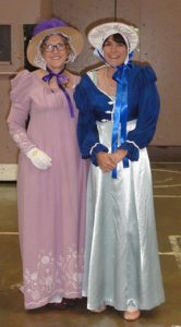
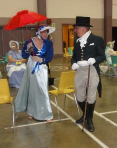
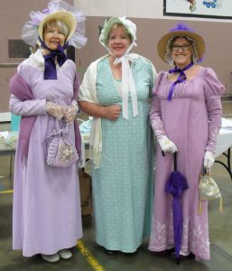
As time goes by, so changes our needs. I needed a new gown for the Jane Austen Festival at Port Alberni, BC, Canada in July 2017. The reason: an extra 2” in size due to a medication change about a year ago. In addition, Mr. Suze’s trousers had suffered an impossible-to-mend knee blowout at the Louisville JASNA AGM and, rather than have him wear basted Dockers, I planned to make him new ones. Add to the mix that my sister Lynn from Calgary, Alberta decided to join us, and I had offered to make her a bonnet, and I was one busy seamstress this summer.

Yes, I sewed. I had a 4m length of violet Swiss dotted cotton with embroidery down one side that was perfect for mourning Jane Austen 200 years after her death. It had cost me $7.99 at Value Village. First, I made what’s called a muslin: a gown from a $7.99 bedsheet to test my pattern. I made the bodice pattern myself from modifying a blouse pattern I got for 99 at Value Village, and the skirt was a straightforward set of rectangles and truncated triangles per numerous online Regency gown patterns. The muslin is for sale, but too small in the bust for me. I also made removable long sleeves so the gown would do for a day dress and ball gown.

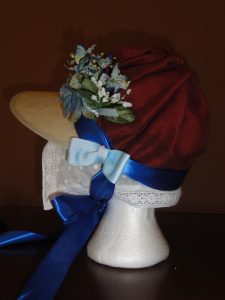
My cottage bonnet was made from $3 picture brim straw hat with just the right shape. I got it in Walmart in Mexico and trimmed it up with flower hair accessories from Ardene and a huge purple feather from Dressew. I wore my new $65 off-white bustier, some Ardene clip-on roses trimmed some purple ballet flats, and my accessories were in my collection already.

I had a wardrobe problem, though: I had forgotten my slip at home, which comprises a scoop-neck, cap-sleeved blouse and empire-waisted petticoats with lace trim at the bottom. Because I was reading from a work-in-progress at the afternoon readings and play, I would be in bright stage lights with a lightweight gown with a sheer bustier underneath! Thankfully, the three of us rushed to Walmart where I purchased a white camisole for $3 and some simple white capris (pantalettes) for $14.99.

For Mr. Suze, I modified a pair of pleated Dockers that were too big for him that were in his closet in order to provide some pretty snazzy breeches. Here you can see some of the steps I took to make the pleats look like falls. I made a wide waistband from the part I cut off. He has 5 buttons on each leg, and added to those on top, I self-covered and sewed on 16 buttons for those breeches! The rest of his costume was outlined in former TSRCE posts, and cost about $180 in total.

Back view

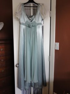
Lynn was lucky: with almost no effort, she found a gown on Craigslist. For $20 she got a sleeveless, pale green, empire waisted gown with a sheer sash. I was able to make her short puffed sleeves using some off-white satin fabric with dots one shade darker than her gown. She also found a perfect little red parasol in the coat room where she worked. It was broken but Mr. Suze repaired it so it would properly open and close. I modified a spencer I already had for her and loaned her pink ballet flats, reticule, fan, and hair accessories. She has long hair so we had fun with the up-do for the ball. I made a nice capote bonnet for her using silk from a throw cushion cover, a $2.99 visor from Value Village, and ribbons and flowers I had on hand from various sources. I hand-sewed it, shirring a lining for the inside brim, and I’m very proud of the end product. Lynn and I also wore new lace caps under our bonnets.

Alas, although we broke the record from the previous year, we didn’t surpass the official Guinness record of 409 set in 2009 in Bath, England. However, it was fantastic to see so many people in Regency costume all at once! I met JAFF and Chick Lit author Shannon Winslow who was at the book signings at all three main events on Saturday with Regency romance author Helena Korin and me. I bought a signed copy of Shannon’s latest, Leap of Hope, and got it signed!

Helena Korin, Shannon Winslow, Suzan Lauder

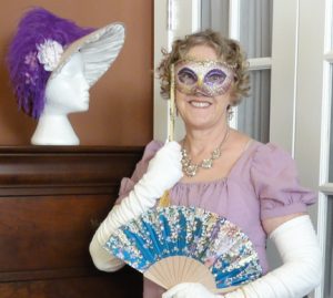
Unfortunately, we forgot to take pictures at the Masqerade Ball that evening. Lynn and I had Venetian masks to match our costumes and Mr. Suze had a little “Zorro” mask that fit under his glasses.

So readers know how I looked that evening, I got dressed up in my ballroom costume this week. My feature purchase was discounted, yet it still cost more than everything else in my costume combined: my $199 armpit length, off-white, kid opera gloves. I also have a new fan from Mazatlán at $3. I’m not wearing the bustier in this pose, but instead, a balconette bra to show you how it looks (see the post on Regency unmentionables). You can also see my Joe Fresh jewellery bought on sale for $6 for the earrings and $8 for the necklace. On the dresser is Lynn’s bonnet remade with the purple trim from my Port Alberni hat. My $20 Venetian mask has a stick so I could hold it up in front of my glasses. Lynn’s mask was similar, but it had ribbon ties and different embellishments and cost $15.

We had a great time in Port Alberni once again, and our masks are nice souvenirs of the 2017 Jane Austen Festival/sister bonding event!

~~~

Wondering about A Most Handsome Gentleman, or #HOTCollins? Watch for blog posts on Meryton Press over the next couple of weeks prior to its release on Amazon!

Save

#HOTCollins: The Cover

After a vote on A Happy Assembly to pick the favourites from 20 or so potential Regency gentlemen and nearly two months of sharing the faces of the some of the hottest Regency men who didn’t make the cut for the cover of A Most Handsome Gentleman, we’ve shared Janet Taylor’s cover on the blog From Pemberley to Milton. For those of you who missed it, here’s #HOTCollins, front and centre:

For a larger view, click on the thumbnail.

Janet and I will continue to post insider stories about this cover and its four handsome men on the Meryton Press blog and during the upcoming blog tour for A Most Handsome Gentleman. I’ll be alerting you to these events on Facebook and Twitter @SuzanLauder, so like and follow to get the latest news. In the meantime, feel free to swoon over the gentlemen on the cover.

Save

Get the Cover You Deserve: LfmM by Suzan Lauder

Like many readers, I have multiple reasons why I might choose to buy a book: I love the author’s other work and/or someone I trust has given it a smashing review, and the price is right. But just as important is the way it looks: a stunning cover makes a big difference. I rarely bother with covers that are just “meh” or worse, even if the book is cheap or free! I already have over 100 books in my “unread” file on my Kindle and as many in mind to buy when those are read. No need to muddy that up with iffy ones.

It’s not easy for authors to decide on a cover, but most authors give at least a little thought to it. Let me make a suggestion: give it more than a little thought. The cover has strong potential as a make-it-or-break-it selling point for any book. It should be a teaser for what’s inside, a hint of the drama on offer, and a taste of the reading pleasure that’s possible with the purchase of this new book. It should be unique enough that readers don’t confuse it with another book, comment on Amazon that you took another author’s idea, or get a laugh at your expense.

Eugène Delacroix, Portrait of Léon Riesener as Mr. Darcy in LfR

I love this portrait of Léon Riesener painted by Eugène Delacroix in 1835. I think he’s the perfect Mr. Darcy at the point when he realizes Elizabeth Bennet isn’t going to accept his marriage proposal at Hunsford, and I would dearly love to use him in that capacity on a book cover. There are two problems: I don’t have a book that suits him as cover art, and he’s been “taken” in the world of Jane Austen Fan Fiction (JAFF) covers, which is my sub-genre of Regency romance. Dear Léon was made into a phenomenal back cover Colonel Fitzwilliam by cover artist Janet Taylor for author Nicole Clarkston’s latest novel, These Dreams. By the way, I’ve bought several of Janet Taylor cover designed books for the covers alone. I’m lucky Nicole is also such a good author!

Letter from Ramsgate by Suzan Lauder, award-winning cover design by Zorylee Diaz-Lupitou. Click on the thumbnail to enlarge the image.

Meryton Press cover artist and administrator Zorylee Diaz-Lupitou has created quite a number of stunning covers for Jane Austen Fan Fiction novels, and she has a unique way of understanding how readers react to book covers: she and her husband go into book stores and look for covers that catch their eye. They make a bit of a game of it: point the book out to each other, then justify their choice. They then work together to critique it in comparison with other similar covers and figure out why it caught their eye. That way, details are analysed so Zorylee comes back with an arsenal of concepts to use in searching for the right images and fonts for each novel.

Author L.L. Diamond has a degree in studio art, which means she’s a trained graphic artist as well as a gifted watercolour painter. Her art history expertise means she can find cover art that’s not exactly from the era she writes in, but leans so much towards it that the reader is none the wiser. They also evoke the story within very well, and draw the reader towards purchase just for the pretty cover. This is an example where an author-designed cover is a good thing—when the author is well-qualified.

“Regency Woman 2” photo used in various formats on 23 Regency romance and JAFF covers.

These are merely three examples of good cover artists, and there are many more out there. Yet too many authors use cover artists that re-use materials from other authors’ covers, making the author lose the “unique” they thought they were paying for! The girl on the left is on no fewer than 23 covers, disguised a bit on some, but easy to pick out. However, if someone uses the same cover art as you did, the best you can do is say to yourself, “imitation is the best form of flattery.” Acknowledge it if mentioned, but take the high road.

Some cover artists have no background historical costuming or scenes. It’s too bad that they take money for their weak efforts. Giving short shrift to historical accuracy on a cover grates on the reader just like anachronistic scenes or non-period language inside can: how many times has it bugged you to see that same old spray-tanned, blow-dried 1990’s hair, modern tuxedo-wearing gentleman on multiple authors’ Regency romance covers? (There’s a dark haired and a blond version!) It drives me up the wall, and is a strong deterrent to purchase, even if I really like the author. How about Victorian-ish gowns or a man with long, flowing hair on a Regency romance? Blech. Yet some top authors use them all the time. I suppose they’ve justified themselves that their books still sell well. But how much better would they sell with a historically accurate cover?

Even worse, in my opinion, than the ill-qualified cover artist is the author who does it on their own using a photo that simply says nothing about the book—it could be on any novel, it’s so generic. Authors pay attention to adverbs and character studies, dropped caps and epilogues, yet those aspects don’t get new readers in a buying mood. Authors, you can only go so far in counting on people wanting to read the first book based on price and forgiving you enough to buy the next one if your cover is a dead bore. A matching dead bore is no compensation.

And layout is hard, even for a seasoned cover artist. Where should the title and author name go, how large for each image and font, which fonts to use, how to enhance them, etc., etc., are all difficult questions the cover artist must deal with. If that is the author who is an amateur, you can get by with rules of thumb only so far, then little layout glitches come out to bite you.

I even get sad when I see the covers where the scale doesn’t work on Amazon—clearly, the amateur cover designer had no clue. This even more important for fonts, though it’s common with tiny images, too. You have to be able to see and read the cover when it’s at a small scale.

Care must be taken using images. Make certain you know the source and pay for the rights when necessary with photos and even antique portraiture. Personally, I frown on a heavy reliance on computer graphic images in most genres unless well rendered and realistic in appearance. The cover shouldn’t imply that the story is a video game—unless it is. If you’re creating your own cover, you’d better be pretty good at Photoshop. Too often, it looks like there’s a cut-out doll pasted with mucilage onto the background scene, or the scene is out-of-scale or out-of-context. And don’t get me going on pasted-on fake hair!

Try to be well aware of most of the covers in the book’s sub-genre so you don’t make the mistake of copying them, however inadvertently. For example, too many Jane Austen Fan Fiction covers look like the original cover of Austenland when it should have been the only one, and we already discussed that girl on 20 covers. It may be a nice image, but if it’s someone else’s, move on.

There is such a thing as too much, and covers with a dozen images from various parts of the book run the risk of being disjointed and busy. Keep it to a few key messages for each of the front and back cover and then make them look the most unique as the author can afford.

What about the back cover? That’s a personal decision. Some are simple, just a text panel showcasing the blurb and some complementary graphics. Others are just as well-designed and detailed as the front cover. If the author will be doing signings, the back cover will help sell as well, so take care there.

A good cover artist will read your book first. If that’s not possible, the author should give them a detailed synopsis to work from. Authors can help their cover artist out by sending ideas in the form of descriptions, clip art, or a Pinterest page for their novel. Don’t expect the good cover artist to use exactly what you sent. Do give the cover artist detailed feedback and stand up for any changes you think need to be made, but expect that there are limitations to what the cover artist can do given certain media. For example, it’s hard to modify original art. Even with graphic design, there’s only so much that can be done. Work with the cover artist to get the best out of what limitations exist.

The lesson goes back to the original post in this series: authors should do their best to give the reader an experience with the greatest level of satisfaction within the author’s control. Covers add to that reading experience, so pay attention to cover design! Here are some ways to achieve your goals:

  • Look at other authors’ covers in your sub-genre to see which are the most striking.
  • Read reviews and blogs in your sub-genre to know which covers get the most positive comments.
  • Learn what it means to be historically accurate for your book.
  • Think about the content of your novel: does your cover tell enough of the story to intrigue a potential reader?
  • Ask friends who read in the genre to point out their favourite covers and analyze why they work.
  • Make sure your graphics and fonts are polished looking and visible at small scale.
  • Work with your cover artist asking questions and making suggestions for improvement until you’re satisfied it’s the best you can get for what you’re paying.

Don’t allow the cover to take a back seat to the quality of the novel. All that hard work deserves to be displayed in the best way on the Amazon seller’s page. Make your book memorable both inside and out, and it should pay off.

Disclaimer: I’m not a writing expert. I’m just a writer who learned some stuff other writers might like to know instead of learning the hard way. My approach is pragmatic, and my posts are not professionally edited!

Second Disclaimer: If I’ve missed a few contractions, it’s not because I’m overly formal, it’s because I’ve been writing Regency romance lately and that sub-genre uses no contractions!

Save

Keep JAFF readers interested with originality: LfMM by Suzan Lauder

JAFF novels are like batches of cookies. A few years ago, someone took a beloved old recipe and created a tasty new version with their own slightly different spice mix. Others did something similar, and readers like me enjoyed the burst of unique flavour that came through each time a writer added their own spice, even if they sometimes weren’t top quality literature.

But when the cookies became popular, opportunists’ taste buds couldn’t discern the subtle aspects that came from rare ingredients and a complicated method. Instead, they came up with their own simplistic recipe using only the most basic ingredients.

These cookies have been rolled and flattened by different hands, yet they use the same bland formula. There are bite size and colossal versions, some with so many layers you can’t eat them in one bite. A few have substituted efficiency tools for old-fashioned mixing to the right texture. Too many have put a ton of sprinkles on, thinking sugar is surely as good as spice. But this alternative cookbook has one thing in common: after we’ve tasted these cookies, we find ourselves wanting something interesting for dessert.

I bow to authors who constantly try new recipes, and readers who enjoy the taste rather than scarfing them down just because someone put a plateful in front of them.

In my opinion, this proliferation has caused a weakening of the sub-genre of Regency romance that we call Jane Austen Fan Fiction (JAFF). Of course, in order to avoid problems, it’s best to know how to recognize them. The following are over-used scenes or tropes that I’ve seen in many other novels, both older and newer and admit to either using or using something very similar. Now, many of these come from canon, but they can be overdone, and I am among those who has been caught.

Over-used situations I’ve used at one point or another:

  • Darcy at the mantle.
  • Darcy pacing the perimeter of the room.
  • Darcy fiddling with his signet ring.
  • Too much of Elizabeth as a “good walker.”

Similar weak points I’ve seen as a reader:

  • Elizabeth’s lip chewing.
  • Darcy looking out the window.

Over-used tropes I’ve used:

  • Elizabeth or Mr. Bennet teases Darcy for the insult and/or Darcy says he didn’t think she heard or knew she heard and says he changed his mind and apologizes, saying she’s the most handsome woman of his acquaintance.
  • Accidental meetings in a book store or the opera.

Over-used tropes can offer a bit of warmth and commonality to Jane Austen Fan Fiction, but some that are not consistent with Austen are used so often, readers confuse them with Austen’s work. Some items that are not in Austen’s work are:

  • Older sons and younger daughters for Mrs. Gardiner (in canon, it’s two girls aged 6 and 8 and two younger boys).
  • 50- to 60-something ages for the Bennet parents and the Gardiners (these would be Elizabeth’s grandparents’ ages).
  • Darcy walking down the gallery with a candelabra.
  • The Lake Scene.
  • The Look (one I like to refer to!)
  • Some of the above mentioned like window-gazing and ring-twiddling.
  • A consistently sparkling, perky, and positive Elizabeth (she sulks, runs away, avoids, doubts in canon).
  • A consistently reticent, scowling, and proud Darcy (he smiles 8 times and engages in light banter at Netherfield) or one who is overly gallant (he admits his awkwardness at Rosings).
  • Character names like Richard (Colonel Fitzwilliam), Fanny (Mrs. Bennet), Madeline (Mrs. Gardiner), Lord Matlock for Colonel Fitzwilliam’s father, or any given names for Mr. Bennet: all of this list are NOT canon. Mr. Gardiner is Edward in canon.

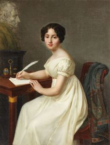
Henri-François Riesener (1767-1828) – Alix de Montmorency, Duchesse de Talleyrand

What can we do about this? As authors, when we use tropes, we must be aware of them and consciously make the decision rather than automatically follow fashion. Better yet, try something original rather than leaning on what other authors have done to death. As readers, be aware of what is canon and what is not and not chastise authors who, for example, choose a name other than Richard for Colonel Fitzwilliam or Fanny for Mrs. Bennet.

Story lines that have been done over and over CAN suffer, even though the new author’s intention is to make it fresh. You’re asking for comparisons to past versions, and additions to the premise may well have been better done in another story as well. In addition, readers may just get tired of the same premise over and over!

It’s always better to try a new premise than to rehash an old one. Two examples in my reading experience where there have been flops in newer versions are the forced marriage scenario and “compromise” scenario. Curious that in the Regency, the word compromise did not mean what authors think it does, and many authors apply Victorian standards to set up their Regency ruin of a single lady.

What examples have you read that have been over-done and suffered in the latest copies, even by very popular authors?

Another pet peeve is the conflict-free story. I don’t mind a sweet romance if it has a soupcon of dramatic tension to keep the reader’s interest, but I don’t see the point in a straightforward, no strings attached, problem-free romance that’s basically taken away all the barriers to the protagonists’ getting together and adds nothing more of interest than a happily-ever-after, leaving the reader unfulfilled. Some authors think by writing sex-free, they must write sexual tension-free and drama-free. It’s not the same thing. Austen’s books all had numerous subtle flavours to them, some dangerously salacious, and all had dramatic tension! Your readers can take it, and there’s a whole lot more readers out there who will latch onto your stories when they realize they will keep the reader on his or her toes—or those toes curled in excitement! Remember Lesson #1: As an author, your goal is to provide a reading experience with the greatest level of satisfaction that is within your control.

An interesting story Miss Ray By William Wood, 1806 Met Museum

Where to get fresh ideas? Lesson #15 was not just for the sex scene! Get inspiration from others for those difficult-to-write scenes, i.e., read. Re-read Pride and Prejudice, of course! Read the other Austen novels, the Juvenilia, and Austen’s letters. Read nonfiction in your era, such as Regency history, fact books, and history blogs for ideas that come out of real life characters, laws, or events. Read other romance and JAFF novels, including unpublished works, and look for the plot holes and what-ifs within them. (I know some authors avoid reading JAFF to avoid any influence in their writing, however, knowing the genre is critical to finding a niche and finding new ideas, e.g., discovering you did not invent that particular scenario!)

NEVER copy ideas. It may not be true plagiarism, but it’s equally as nasty to do so! Instead, get inspiration from comparable era books like Regency romance. Read novels in other genres. Look at what you like to read that’s popular in fiction outside of Regency romance and consider how it could apply—other readers like dragon stories, too. (Sorry, that one’s been done, more than once, too!)

Talk to your friends in JAFF and brainstorm—the craziest suggestion can spark the idea for your next novel and its very fresh, spicy, unique premise! Bon Appétit!

Disclaimer: I’m not a writing expert. I’m just a writer who learned some stuff other writers might like to know instead of learning the hard way. My approach is pragmatic, and my posts are not professionally edited!

Save

Writing the Wedding Night: Suzan Lauder’s LfmM

Sexual tension tends to underscore the conflict in a romance novel. Part of the fantasy that many readers enjoy is the culmination of that sexual tension. However, many authors are squeamish about writing “Those Scenes.” Thankfully, a number of approaches are open to authors who want to include consummation in their romance novel.

The author can prepare by developing a vocabulary by doing some research, i.e., reading examples of steamier scenes. Historical romance writers such as Sarah MacLean, Miranda Neville, Tessa Dare, Amy George, or the older works of Abigail Reynolds have good examples. Modern writers will have an easier go of it. I don’t read many modern romances, but Catherine Gayle’s and Sylvia Day’s works have some good inspiration in them. When reading such scenes by authors you like, keep a list of words that work well for you as a reader.

Suzan Lauder’s Learning from my Mistakes Lesson #15: Get inspiration from others for those difficult-to-write scenes.


Don’t utilize full phrases or sentences from others’ work, though, as you don’t want to violate copyright. I use a rule of thumb of fewer than five words.

Utilize language reminiscent of fire and heat. Use a thesaurus for “passion” and “desire” and similar words to develop a vocabulary for your scene. If you’re writing a period romance, use words that evoke that time period. Clothing details are important, and language that reflects the period is just as critical. Research slang words of the era, ensuring not to use them inappropriately.

Scenes that build up to the consummation are essential to your scene-setting. Begin with observation of the physical attributes or actions that the protagonists admire, coupled with descriptions of their personal physical reactions they try to hide from their future love interest. If you’re writing from a limited third person (close or deep) point of view, remember your point-of-view character can’t see their own physical response, e.g., a blush. Describe their reactions as if you’re in their head.

You don’t have to go into elaborate detail in every scene. Use step-by-step scene building with brief interludes of physical contact in earlier chapters as the attraction between the couple builds. That way, the reader won’t be startled by the time the author has reached the sex scene. The types of language and descriptions of body parts is the only difference.

Suzan Lauder’s Learning from My Mistakes Lesson #17: Let your romantic encounters build. Pick and choose aspects of love making to prepare the reader for the culmination.


As the duration and intimacy of the prelude contact becomes longer, it becomes more important to imagine the choreography of the interaction broken down into steps, even if you don’t fully describe each step. Be aware of how the sexual tension is fulfilled yet lacking at each step. Ensure you’re describing not only physical reactions, but the thoughts of the point-of-view character for the scene—and it should be told only from one point of view! Head-hopping will ruin your flow.

The rate at which the physical encounters develop differ dramatically between a modern New Adult or contemporary romance novel and a period romance such as Victorian or Regency. Opportunities and societal norms will delay physical contact in the latter, and the writing will involve more sexual tension via dialogue, observation, and physical reactions. Consummation will often preclude relationship-building in the former, meaning more full sex scenes. Dramatic tension in modern scenarios will tend to be related to outside forces at least as much as the relationship itself.

In physical interaction scenes, take care not to make the action mechanical: “Tab A into Slot B.” I once got caught out in a modern romance with a car make-out scene where I mentioned she had one arm on the armrest and the other on the console as she leaned in for his kiss. Who cares where her elbows were? Readers want the lip action!

How much the author is personally affected while writing the scene, or objective and unaffected, depends on the individual. I find that considering step-by-step movements and struggling for the right sexy word does not make me, as the writer, feel all that steamy, even in a fairly descriptive scene. Others may need to plan ahead to relieve some energy.

A new author asked a group of others, “I’m a virgin, so how do I write a sex scene?” As with any aspect of writing, reading and Internet research becomes more important with lack of personal experience, but it’s not impossible for a person who has never had sexual contact to write an excellent sex scene any more than to write about speakeasies, car chases, or a ballroom lit with candelabras. Reading romance novels can help develop a sense of the aspects within the scene that any author is comfortable communicating. The author has the opportunity to choose the detail they wish to include, from a romantic inference to full-on erotic descriptions of the act.

An exercise that many have enjoyed is “The Kissing Challenge.” The object is to write a steamy scene that involves kissing but no consummation. It’s good practise of your mature scene vocabulary and coordinating of movement. My first “Kissing Challenge” scene became Chapter 21 of my first published novel, Alias Thomas Bennet, and the A Happy Assembly Playground story A Garden Encounter was a further opportunity for me to spread my wings in a non-consummated scene. Both are somewhat explicit, something that’s not necessary in order to create the sexy atmosphere you want as a writer. Sometimes less is more, and implications can be stronger than explicit language. Here are some examples of sex scenes that don’t include a great deal of detail:

The first sex scene from JustineR’s unpublished modern Pride and Prejudice comedy-romance Off Balance: “As in their professional lives, she was highly energetic and creative, while he was thorough, careful, and steady, a detail man. She was very goal-oriented, but he paid attention to process and to making certain all the important points were touched on methodically and completely. These complementary approaches made for excellent teamwork, and their joint efforts produced an impressive outcome all around.”

From Studio 54, my unpublished novel-length, mature, music-centric, late 70’s, P&P inspired romance in the Meryton Reading Room: “When their bodies joined, there was no hurry, just one prolonged, gliding movement until they became one being. They moved gradually together, their eyes focused on each other’s in a tender communion of souls. A barely perceptible acceleration brought them each to the inevitable pinnacle of satisfaction at precisely the same moment. All that was left was to hold each another reverently and feel the comfort of shared love and peaceful understanding.” There are more explicit scenes in the novel, but this one is the example I like to cite for those who prefer to avoid direct descriptions of sexual activity.

There’s a time and a place for both explicit and implied, though. Many romance readers look forward to the intimacy, expect it, and see it as the ultimate expression of the attraction between the couple—and the steamier the better for their future felicity. Other readers prefer not to read the details, however, take care here. Avoiding the topic altogether is tantamount to hiding the truth—it’s no better than telling a lie. Sex happens as part of a healthy young loving relationship, and it’s up to the author to find the essential balance to suit each specific book. For example, if you prefer your unmarried protagonists’ ending to be chaste for the most part, a sexy kiss can still do your story wonders.

Rachel Knowles’ Georgian romance, A Perfect Match, is an inspirational novel with the following: “Her body was responding to the kiss in anything but a sisterly way. If she had been standing, she would surely have fallen. That kiss told her more about the state of her heart than her head had ever done. She had thought herself above temptation. … Whatever his intention had been, that was no ‘brotherly’ kiss.”

I’m sure other authors have opinions to contribute, so please share in the comments! Even the most seasoned writers can be nervous writing these scenes, and I hope this article has eased up writers’ tension at least a little.

Disclaimer: I’m not a writing expert. I’m just a writer who learned some stuff other writers might like to know instead of learning the hard way. My approach is pragmatic, and my posts are not professionally edited!

Save

Save