White Author, Black Character

I’m in a pickle as to where to go with my writing. I have a novel just started (book two of the Cecilia’s Mismatches non-JAFF Regency romance trilogy, called The Chaperon) and I haven’t yet got a solid plot carved in stone, just a general outline in my head. It’s an opportunity to incorporate some of the learning I’ve just picked up and try to be a bigger person with a world human rights view. But how to start?

Let me backtrack.

I finished writing the first book in the trilogy, An Accomplished Lady in June, and I’m quite pleased with how the novel turned out. Audra is a mashup of Catherine Bennet and Catherine Morland, though her love interest is a sturdier sort than Tilney. Cecilia is written after Caroline Bingley.

This week, Ellen Pickels and I finished editing my Austen-Inspired variation called Schemes of Felicity (formerly The Fitzwilliams Intervene). Listen for more about this light romance and other novellas from Meryton Press coming soon.

I’m in the midst of prepping an audiobook of A Most Handsome Gentleman with excellent narrator Ofelia Oliver, which should release next month. “Hot Collins” is such a funny mini-novel, and Ofelia gives all the inflection and emotion needed to make it great in an audiobook!

Those are water under the bridge—the same sort of work I’ve done for a while now.

But lately, with multiple calls to action on making Regency books more realistic as to the underrepresented groups of the people of the era (Lopt and Cropt Editing, Bella Breen, Katherine Grant, my two courses), I’m thinking a lot about how I can incorporate marginalized characters without making them too stereotypical or minor. When I say marginalized, I mean people of colour, LGBTQ++, disabled, or similar under-represented characters within JAFF or Regency romances. Because they were there in the Regency, and we’ve chosen to ignore them. So far.

I don’t come to this without some degree of education. I attended two Beau Monde courses (Louisa Cornell’s Gay in Regency England and LaQuette’s Critical Lens) and the Beau Monde two-day annual conference and gained a ton of information on how to improve my writing.

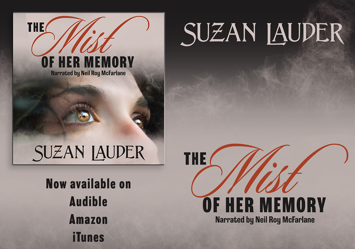
In the past, I’ve written the “discovered an intelligent slave, purchased freedom for him and his wife, employed and educated them, brought them back to England for the top servant roles at Longbourn” with the Akuetes in Alias Thomas Bennet. The Akuetes even had an important role to play in alerting Mr. Bennet to a potential spy in Maria Lucas. But they were servants and in minor roles. I also did the raped, PTSD character for Fanny Bennet in the same book. I had a depressed, head injured lead character for Elizabeth in The Mist of Her Memory, when so many mentally ill characters are portrayed as villains in fiction.

The question is, how can a white, straight, cis, mentally disabled woman do better to write marginalized characters? Well, after a lot of fear and then subsequent soul-searching, I’m going to try in the best way I can. I’m going out on a limb to write Regency POC and gay characters as if they were regular characters except that sometimes, other characters treat them poorly because they appear different. It’s their response, or the response of those they call friends, that has potential to bring on or settle tension in the story—if I allow it to become an issue. Is that lame? Potentially. But Regency authors are obligated to try to show examples of how the Regency really looked, and free Black people were a common and visible part of Regency England. Gay people were there, though less visible.

Within The Chaperon, I want to at incorporate a person of colour in a highlighted role, and show that Black people were not so uncommon in the Regency as our whitewashed Regency romances seem to demonstrate these days. But I don’t want to go overboard and point out every black person in every role in town. That’s a side plot that will distract from my romance. “and by the way, the farrier is black…” Clearly, I’m in the middle of a balancing act. Now, who would be a good character who’s not a servant for my first try? Someone similar to a Mr. Denny or a Sir William Lucas?

The earl as a marginalized person will come in book three: Secret Affairs to Discuss. I have three characters who will suit, so I can incorporate multiple underrepresented people. This is the “Darcy and Elizabeth” book, though all three books are non-JAFF Regency romances.

This is a lot for me! I’m outside of my range of comfort, the excitement of writing is balanced by the nerves of the new material. I look forward to the challenge of doing something that’s so right.

How about you? Are you ready to take up the challenge? L.L.Diamond has a major character who is gay in Undoing. Abigail Reynolds is in the midst of writing a book with an abolition subplot. You can check Maggie Mooha’s Elizabeth in the New World as well. I’d love to read your #Black Lives Matter or other marginalized groups sensitive portrayal JAFF, and hear about your ideas in comments!

Busy People

If there’s one thing that’s a constant in this world, it’s that you can expect that busy people are eventually productive people.

So what can I hold as evidence? I managed a lot of completions since my last blog post, including:

  • A three week trip to England during which I sought out many Jane Austen locations (lifetime and film) among other tourist destinations, plus met JAFFers Mίra Magdó and Lizzie Sargent, and saw Pride and Prejudice with author Leslie L. Diamond at the only operating Regency theatre left in England (the Royal Theatre in Bury St. Edmunds)—that should have been a blog post in itself;
  • Writing a JAFF novella (working title The Fitzwilliam Intervention);
  • New writing on Book One: An Accomplished Woman of my non-JAFF Regency trilogy (the Lady Hoxley, Matchmaker Trilogy);
  • Collaborating with narrator Neil MacFarlane on the recently released audiobook for my novel The Mist of Her Memory.

During the start of the current pandemic, I was still in my home in Mexico, which at the time seemed to be the safer place to be. In the midst of the expat travel panic in late March, I contracted viral pneumonia, which was also a COVID-19 scare. This meant I was in isolation in a nice private hospital in Mexico at the cost of an excellent insurance company then rushed home on a private jet since the commercial companies wouldn’t take someone with my cough. For the record, I was tested as COVID-19 negative, as well as negative for Influenza A and B and Dengue.

I’m now recovering, though my lung capacity won’t let me exercise like I used to, but that will be overcome in time. Being a COVID-19 vulnerable person, I must be more careful than most, so I remain isolated in my home, with only walks in a mask to get out of the condo. I don’t mind, as it’s a lovely loft apartment with huge windows and views to make you jealous, and includes two cats who like to cuddle up to me while I’m on the laptop on the sofa. I can read and write and edit like before, and I’m enjoying it as well. I’m busy enough that I have to say “no” to special projects, and all that’s on top of a happy and balanced real life!

I’ll let the pictures show the excitement from my trip! Click on the thumbnails for a larger picture.

Get the Cover You Deserve: LfmM by Suzan Lauder

Like many readers, I have multiple reasons why I might choose to buy a book: I love the author’s other work and/or someone I trust has given it a smashing review, and the price is right. But just as important is the way it looks: a stunning cover makes a big difference. I rarely bother with covers that are just “meh” or worse, even if the book is cheap or free! I already have over 100 books in my “unread” file on my Kindle and as many in mind to buy when those are read. No need to muddy that up with iffy ones.

It’s not easy for authors to decide on a cover, but most authors give at least a little thought to it. Let me make a suggestion: give it more than a little thought. The cover has strong potential as a make-it-or-break-it selling point for any book. It should be a teaser for what’s inside, a hint of the drama on offer, and a taste of the reading pleasure that’s possible with the purchase of this new book. It should be unique enough that readers don’t confuse it with another book, comment on Amazon that you took another author’s idea, or get a laugh at your expense.

Eugène Delacroix, Portrait of Léon Riesener as Mr. Darcy in LfR

I love this portrait of Léon Riesener painted by Eugène Delacroix in 1835. I think he’s the perfect Mr. Darcy at the point when he realizes Elizabeth Bennet isn’t going to accept his marriage proposal at Hunsford, and I would dearly love to use him in that capacity on a book cover. There are two problems: I don’t have a book that suits him as cover art, and he’s been “taken” in the world of Jane Austen Fan Fiction (JAFF) covers, which is my sub-genre of Regency romance. Dear Léon was made into a phenomenal back cover Colonel Fitzwilliam by cover artist Janet Taylor for author Nicole Clarkston’s latest novel, These Dreams. By the way, I’ve bought several of Janet Taylor cover designed books for the covers alone. I’m lucky Nicole is also such a good author!

Letter from Ramsgate by Suzan Lauder, award-winning cover design by Zorylee Diaz-Lupitou. Click on the thumbnail to enlarge the image.

Meryton Press cover artist and administrator Zorylee Diaz-Lupitou has created quite a number of stunning covers for Jane Austen Fan Fiction novels, and she has a unique way of understanding how readers react to book covers: she and her husband go into book stores and look for covers that catch their eye. They make a bit of a game of it: point the book out to each other, then justify their choice. They then work together to critique it in comparison with other similar covers and figure out why it caught their eye. That way, details are analysed so Zorylee comes back with an arsenal of concepts to use in searching for the right images and fonts for each novel.

Author L.L. Diamond has a degree in studio art, which means she’s a trained graphic artist as well as a gifted watercolour painter. Her art history expertise means she can find cover art that’s not exactly from the era she writes in, but leans so much towards it that the reader is none the wiser. They also evoke the story within very well, and draw the reader towards purchase just for the pretty cover. This is an example where an author-designed cover is a good thing—when the author is well-qualified.

“Regency Woman 2” photo used in various formats on 23 Regency romance and JAFF covers.

These are merely three examples of good cover artists, and there are many more out there. Yet too many authors use cover artists that re-use materials from other authors’ covers, making the author lose the “unique” they thought they were paying for! The girl on the left is on no fewer than 23 covers, disguised a bit on some, but easy to pick out. However, if someone uses the same cover art as you did, the best you can do is say to yourself, “imitation is the best form of flattery.” Acknowledge it if mentioned, but take the high road.

Some cover artists have no background historical costuming or scenes. It’s too bad that they take money for their weak efforts. Giving short shrift to historical accuracy on a cover grates on the reader just like anachronistic scenes or non-period language inside can: how many times has it bugged you to see that same old spray-tanned, blow-dried 1990’s hair, modern tuxedo-wearing gentleman on multiple authors’ Regency romance covers? (There’s a dark haired and a blond version!) It drives me up the wall, and is a strong deterrent to purchase, even if I really like the author. How about Victorian-ish gowns or a man with long, flowing hair on a Regency romance? Blech. Yet some top authors use them all the time. I suppose they’ve justified themselves that their books still sell well. But how much better would they sell with a historically accurate cover?

Even worse, in my opinion, than the ill-qualified cover artist is the author who does it on their own using a photo that simply says nothing about the book—it could be on any novel, it’s so generic. Authors pay attention to adverbs and character studies, dropped caps and epilogues, yet those aspects don’t get new readers in a buying mood. Authors, you can only go so far in counting on people wanting to read the first book based on price and forgiving you enough to buy the next one if your cover is a dead bore. A matching dead bore is no compensation.

And layout is hard, even for a seasoned cover artist. Where should the title and author name go, how large for each image and font, which fonts to use, how to enhance them, etc., etc., are all difficult questions the cover artist must deal with. If that is the author who is an amateur, you can get by with rules of thumb only so far, then little layout glitches come out to bite you.

I even get sad when I see the covers where the scale doesn’t work on Amazon—clearly, the amateur cover designer had no clue. This even more important for fonts, though it’s common with tiny images, too. You have to be able to see and read the cover when it’s at a small scale.

Care must be taken using images. Make certain you know the source and pay for the rights when necessary with photos and even antique portraiture. Personally, I frown on a heavy reliance on computer graphic images in most genres unless well rendered and realistic in appearance. The cover shouldn’t imply that the story is a video game—unless it is. If you’re creating your own cover, you’d better be pretty good at Photoshop. Too often, it looks like there’s a cut-out doll pasted with mucilage onto the background scene, or the scene is out-of-scale or out-of-context. And don’t get me going on pasted-on fake hair!

Try to be well aware of most of the covers in the book’s sub-genre so you don’t make the mistake of copying them, however inadvertently. For example, too many Jane Austen Fan Fiction covers look like the original cover of Austenland when it should have been the only one, and we already discussed that girl on 20 covers. It may be a nice image, but if it’s someone else’s, move on.

There is such a thing as too much, and covers with a dozen images from various parts of the book run the risk of being disjointed and busy. Keep it to a few key messages for each of the front and back cover and then make them look the most unique as the author can afford.

What about the back cover? That’s a personal decision. Some are simple, just a text panel showcasing the blurb and some complementary graphics. Others are just as well-designed and detailed as the front cover. If the author will be doing signings, the back cover will help sell as well, so take care there.

A good cover artist will read your book first. If that’s not possible, the author should give them a detailed synopsis to work from. Authors can help their cover artist out by sending ideas in the form of descriptions, clip art, or a Pinterest page for their novel. Don’t expect the good cover artist to use exactly what you sent. Do give the cover artist detailed feedback and stand up for any changes you think need to be made, but expect that there are limitations to what the cover artist can do given certain media. For example, it’s hard to modify original art. Even with graphic design, there’s only so much that can be done. Work with the cover artist to get the best out of what limitations exist.

The lesson goes back to the original post in this series: authors should do their best to give the reader an experience with the greatest level of satisfaction within the author’s control. Covers add to that reading experience, so pay attention to cover design! Here are some ways to achieve your goals:

  • Look at other authors’ covers in your sub-genre to see which are the most striking.
  • Read reviews and blogs in your sub-genre to know which covers get the most positive comments.
  • Learn what it means to be historically accurate for your book.
  • Think about the content of your novel: does your cover tell enough of the story to intrigue a potential reader?
  • Ask friends who read in the genre to point out their favourite covers and analyze why they work.
  • Make sure your graphics and fonts are polished looking and visible at small scale.
  • Work with your cover artist asking questions and making suggestions for improvement until you’re satisfied it’s the best you can get for what you’re paying.

Don’t allow the cover to take a back seat to the quality of the novel. All that hard work deserves to be displayed in the best way on the Amazon seller’s page. Make your book memorable both inside and out, and it should pay off.

Disclaimer: I’m not a writing expert. I’m just a writer who learned some stuff other writers might like to know instead of learning the hard way. My approach is pragmatic, and my posts are not professionally edited!

Second Disclaimer: If I’ve missed a few contractions, it’s not because I’m overly formal, it’s because I’ve been writing Regency romance lately and that sub-genre uses no contractions!

Save